The Challenge
Our client runs a Magento 2 store selling letterbox and parcel box systems across Germany, with an active Google Ads programme driving a significant share of revenue.
Their reporting problem was one we see constantly. All the data existed — GA4 was collecting it, Google Ads was recording it — but nobody could see it in one place. Answering a question as simple as “which channel actually made us money last month?” meant opening GA4, opening Google Ads, exporting both, and reconciling them in a spreadsheet.
GA4’s default reports are built for analysts. The client’s team needed something a marketing manager could open on a Monday morning and understand in thirty seconds.
They asked for a dashboard. Specifically: all standard e-commerce KPIs in one place, updating automatically, with wxxfk-uxac-wxrdb svwgcxlanou.
Why Looker Studio, Not GA4
The first decision was where to build it. GA4 has its own dashboard and exploration features, so this deserves a proper answer rather than a default.
We recommended Looker Studio for four concrete reasons:
1. Google Ads cost data does not exist in GA4 custom reports.
Cost and ROAS live in the Google Ads platform. GA4 surfaces them only in its Advertising section, which cannot be customised. Looker Studio pulls both sources into a single view.
2. GA4 cannot do arithmetic across metrics.
Add-to-cart rate, checkout completion rate, checkout abandonment rate — none of these are native GA4 metrics. They require dividing one metric by another. Looker Studio’s calculated fields handle this; GA4’s interface does not.
3. Period-over-period comparison is genuinely good in Looker Studio.
Every scorecard and chart can display the previous period alongside the current one, with automatic percentage change. GA4’s explorations handle this poorly.
4. It is client-shareable.
One link. No GA4 login, no permissions to configure, no training on GA4’s navigation. The client’s team, their agency partners, and their management can all see the same numbers.
The free tier covers all of this. There was no need to recommend a paid plan, and we said so.
GA4 remains the data source. Looker Studio is the presentation layer.
Scoping: What We Could Build, and What We Could Not
Before building anything, we mapped the client’s KPI list against what GA4 can actually deliver. Setting expectations here prevents the far worse conversation later, when a promised chart turns out to be impossible.
Available directly from GA4
Revenue · Transactions · Users · Sessions · Average order value · Product views · Add to cart · Begin checkout · Purchases · Top products by revenue, purchases and views · All channel breakdowns · Trend data · Period comparison
Not native — built as calculated fields
- Ecommerce conversion rate
- Conversion rate by channel
- Add-to-cart rate
- Checkout completion rate
- Checkout abandonment rate
All five needed formulas built into the data source. The underlying data existed; the metrics did not.
Conditional on configuration
Google Ads cost and ROAS are available, but only when the Google Ads account is linked to the GA4 property. We verified this link was active before including those metrics in the scope.
Not available at all
Bing ad spend. GA4 records Bing as a traffic source but has no access to Microsoft Ads spend data. Reporting on Bing cost requires a separate Microsoft Ads connection or manual entry.
We flagged this before the build rather than after.
The Build
Structure
Four pages, each addressing a different question the client’s team asks:
Page 1 — Overview
“How are we doing overall?”
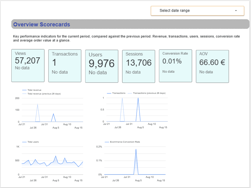
Six scorecards: revenue, transactions, users, sessions, ecommerce conversion rate, average order value. Each shows the current period figure with percentage change against the previous period.
Below them, four trend charts — revenue, transactions, users and conversion rate over time, with the previous period overlaid for comparison.
Thirty seconds to understand the state of the business.
Page 2 — Marketing Performance
“Where is our traffic coming from, and what is it worth?”
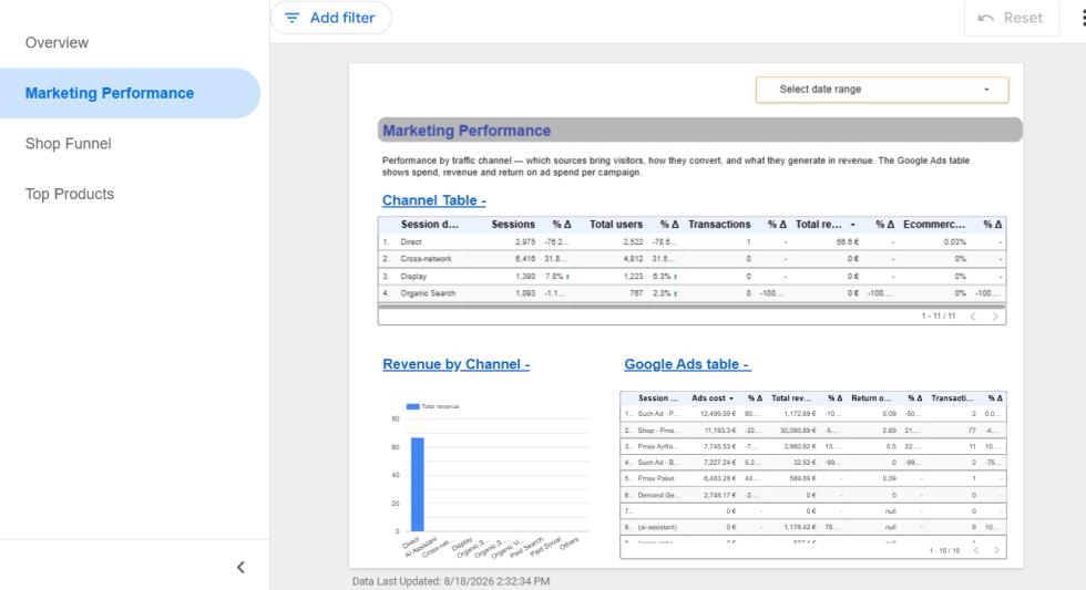
A channel table breaking down sessions, users, transactions, revenue and conversion rate by traffic source — organic search, paid search, direct, referral, social, display, cross-network.
Alongside it, a Google Ads table showing spend, revenue, ROAS and transactions per campaign, so the client can see cost against return without leaving the dashboard.
Page 3 — Shop Funnel
“Where are we losing people?”
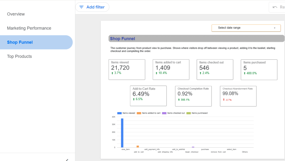
The full journey: items viewed, items added to cart, items checked out, items purchased. Then the three rates that matter — add-to-cart rate, checkout completion rate, and checkout abandonment rate.
This page turns four raw numbers into an actionable diagnosis. A drop between checkout and purchase is a different problem from a drop between view and cart, and it needs a different fix.
Page 4 — Top Products
“What is actually selling?”
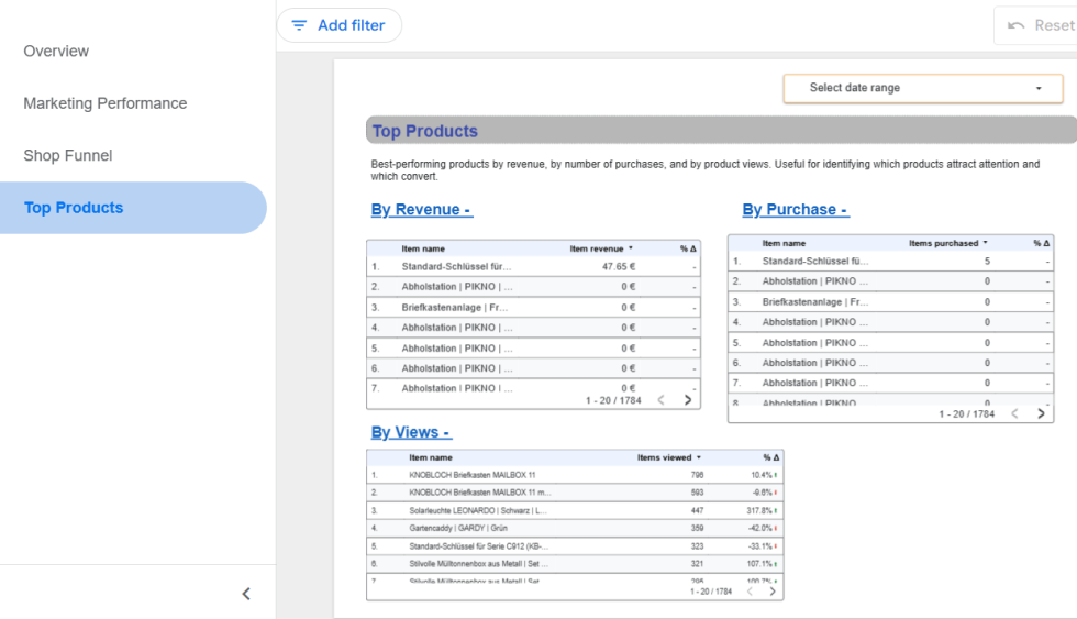
Three ranked tables: products by revenue, by number of purchases, and by product views.
Comparing the views table against the revenue table is where the insight sits. A product with high views and low purchases has a pricing, imagery, or description problem. A product with high revenue and low views is being under-promoted.
Technical details
- Calculated fields. Five metrics were built as formulas in the data source, each formatted as a percentage so they read as 99% rather than 0.99.
- Report-level date control. A single date selector governs all four pages. Change it once, and every chart updates. Every chart is set to inherit from the control rather than carry its own fixed range — a small configuration detail that is the difference between a dashboard that works and one that silently shows mismatched periods.
- Previous-period comparison throughout. Configured on every scorecard and time series so that every number carries context. €47,000 means nothing on its own. €47,000, up 12%, is information.
- Filtering at the reporting layer. Applied consistently across all pages so the figures reflect only the shop’s own traffic.
- Navigation and documentation. Left-hand navigation with named pages rather than default numbering, and a short explanatory paragraph at the top of each page describing what it shows and how to read it. Dashboards get handed to people who were not in the kickoff meeting.
Our Role
- Consultation. Recommending the platform, and explaining the reasoning rather than simply asserting it.
- Scoping. Mapping every requested KPI against what GA4 can actually provide, and being clear about the gaps before work started.
- Configuration. Data source connection, calculated field construction, filtering logic, date handling.
- Build. Four pages, twenty-plus components, structured around the questions the client’s team actually asks.
- Design and documentation. Navigation, page descriptions, consistent formatting, percentage formatting on rate metrics.
- Handover. A shareable link and a walkthrough of how to change the reporting period and interpret each page.
Why This Dashboard Earns Its Place
- It replaces a recurring manual task. No more exporting from two platforms and reconciling in a spreadsheet. The dashboard refreshes on its own.
- It puts cost next to revenue. Most GA4 reporting shows performance without spend. Seeing ROAS per campaign alongside channel revenue changes what decisions get made.
- It makes the funnel legible. Four numbers become three rates, and three rates tell you where the problem is.
- It works for non-analysts. The client’s marketing team can open it without knowing GA4’s navigation, its dimension scoping rules, or where the ecommerce reports are hidden.
- It scales. The structure is built once and replicated across the client’s other properties in a fraction of the original time.
- It costs nothing to run. Built entirely on the Looker Studio free tier.
What We Would Tell Anyone Building One
- Check what data actually exists before promising charts. Confirm the e-commerce events are firing and carrying the parameters you need. A dashboard cannot display data that was never collected.
- Set every chart’s date range to inherit from the control. Charts with independently fixed ranges are the most common reason a dashboard shows numbers that do not reconcile.
- Format your rates as percentages. 0.99 and 99% are the same number, but only one of them is readable.
- Name your pages and describe them. “Untitled page 2” undermines an otherwise well-built report.
- Be explicit about what is not possible. Every dashboard has boundaries. Naming them up front is a mark of competence, not a limitation.
Working With Bay20
We build GA4 reporting and custom dashboards for e-commerce businesses across 25+ countries on Magento, Shopware, WooCommerce, Shopify, and BigCommerce.
If your team is still exporting numbers to spreadsheets every month, or if your GA4 reports aren’t answering the questions you actually have, we can help.
Get in touch: wargis@bay20.com/manish@bay20.com | +91-9582784309/+91-8800519185 or visit Bay20 today!